How to Make a Graph or Chart in Excel

Are you struggling to visualize your data in Excel? Do you want to create a graph or chart that effectively communicates your message, but don't know where to start? You're not alone. Many users face challenges when it comes to creating charts and graphs in Excel, often due to a lack of understanding of the software or simply not knowing the right steps to take.
The good news is that creating a graph or chart in Excel is easier than you think. With a few simple steps, you can take your data from a dull, text-based format to a visually appealing and informative chart that tells a story. In this article, we'll walk you through the process of creating a graph or chart in Excel, from selecting your data to customizing your chart.
Before we dive into the solution, let's take a quick look at why creating charts and graphs in Excel is so important. Data visualization is a powerful tool that allows us to communicate complex information in a clear and concise manner. By presenting data in a visual format, we can quickly identify trends, patterns, and insights that might be difficult to spot in a text-based format. Whether you're a business owner, student, or simply someone who wants to make sense of your data, creating charts and graphs in Excel is an essential skill to have.
If you don't have Microsoft Excel yet, you can download it from Microsoft Excel. You can also find useful Excel templates at Excel Templates. Additionally, you may want to consider Free Word Alternatives to Microsoft Word You’ll Love, which can provide alternatives to Microsoft Office, including Excel. Furthermore, you can also check How to Download and install Ubuntu on your computer, which can provide information on alternative operating systems that can be used with Excel.
Step 1: Select Your Data

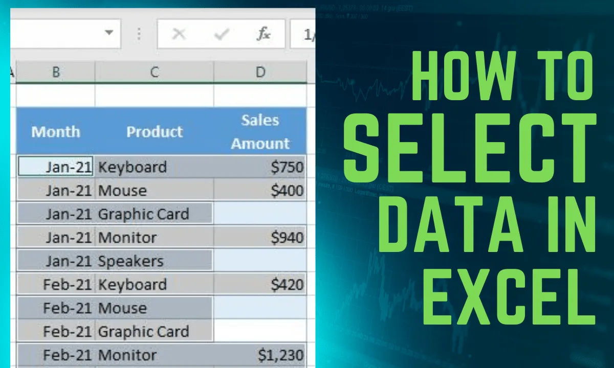
The first step in creating a graph or chart in Excel is to select the data you want to include. This includes headers, labels, and any other relevant data that you want to display in your chart. To select your data, simply click and drag your mouse to highlight the cells that contain the data you want to use.
Tips for Selecting Your Data:
- Make sure to include headers and labels to provide context for your data.
- Use a consistent format for your data to ensure that Excel can read it correctly.
- If you have a large dataset, consider using a table or pivot table to make it easier to manage and select your data.
If you're having trouble formatting your data, you can check out How to convert text to number in Excel, which can provide assistance with data formatting.
Step 2: Insert a Chart

Once you've selected your data, it's time to insert a chart. To do this, go to the Insert tab in the ribbon and click on Recommended Charts. This will open a dialog box that shows you a selection of chart types based on your data.
Choosing a Chart Type
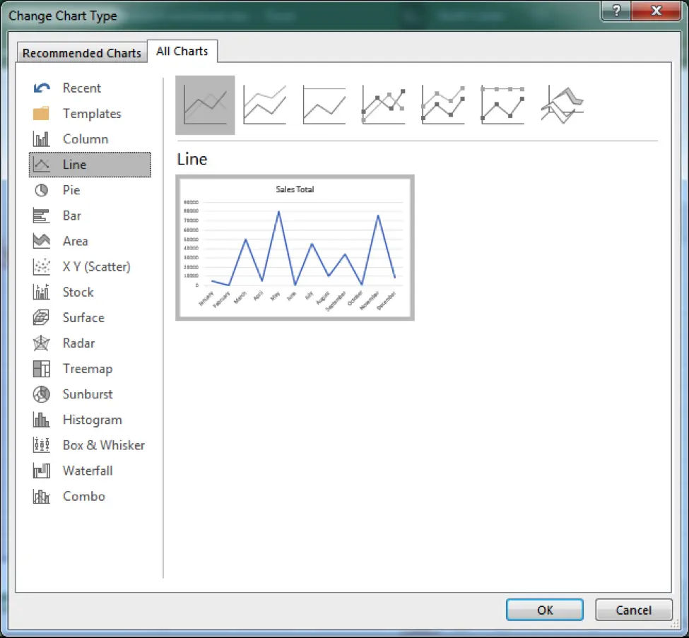
Don't worry if you're not sure what type of chart to use - Excel will suggest some options based on your data. If you prefer to choose a specific type, click on the All Charts tab to view all available chart types.
Popular Chart Types:
- Bar chart: Great for comparing data across different categories.
- Line chart: Ideal for showing trends and patterns over time.
- Pie chart: Perfect for displaying proportions and percentages.
Step 3: Choose Your Chart Type

Now that you've inserted a chart, it's time to choose the type of chart you want to create. Select the type of graph you want to create from the options available. Excel offers a wide range of chart types, so choose one that best represents your data. Don't worry if you're not sure - you can always switch to a different type later if needed.
Tips for Choosing a Chart Type:
- Consider the type of data you're working with and what type of chart will best display it.
- Think about the message you want to communicate with your chart and choose a type that will help you do so.
- Don't be afraid to experiment with different chart types to see what works best for your data.
Step 4: Create the Chart

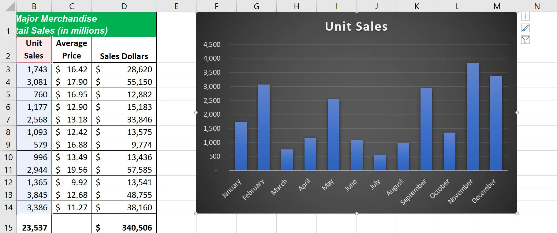
After selecting your chart type, click "OK" to insert the chart into your worksheet. Your chart will now be displayed in your worksheet, and you can start customizing it to suit your needs.
Step 5: Customize Your Chart
Now that you've created your chart, it's time to customize it. To switch the data orientation, select the chart, go to the Chart Design tab, and click Switch Row/Column. To adjust the legend position, select the chart, click the + button on the right side, click the arrow next to Legend, and choose Right.
Customization Options:
- Change the chart title: Update the title of your chart to reflect the data you're displaying.
- Add data labels: Add labels to your chart to provide more context and information.
- Change the chart colors: Update the colors of your chart to match your brand or style.
Step 6: Add Titles and Labels
Add a title to your graph and any necessary data labels to enhance clarity. This will help your audience understand the data you're displaying and what the chart is trying to communicate.
Tips for Adding Titles and Labels:
- Keep your title concise and to the point.
- Use clear and concise language for your data labels.
- Consider adding a subtitle or footnote to provide additional context.
Step 7: Save Your Document

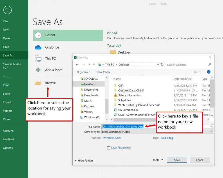
Once you are satisfied with your chart, save your Excel document. This will ensure that all your hard work is saved and you can easily access your chart later.
Tips for Saving Your Document:
- Save your document regularly to avoid losing your work.
- Consider saving multiple versions of your document to track changes and updates.
- Use a clear and descriptive filename to make it easy to identify your document.
By following these steps, you can effectively create and customize charts in Excel to visualize your data. Remember to keep it simple, clear, and concise, and don't be afraid to experiment with different chart types and customization options. Happy charting!
Additionally, you can visit Data Visualization in Excel for more information on data visualization tools in Excel. For any questions or issues with Excel, you can visit Office Support for assistance. Don't forget to Set Up a VPN on Your Computer for Secure Browsing, which can provide information on securing your computer while working with Excel online.


